

Table of contents
Media Query
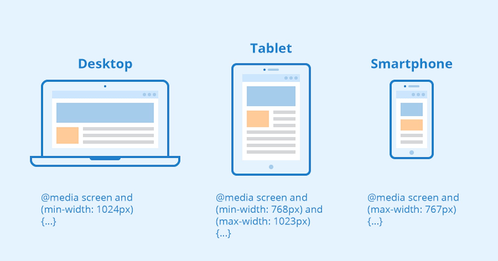
Media Query makes the web page responsive. Media query is used for three screen sizes to make it responsive. Mobile Screen, Laptop Screen and Desktop Screen. Max-width and Min-width are breakpoints to make the screen responsive.
How to declare media queries
Media Queries start with the @media declaration. The main purpose of writing this is to tell the browser that we have specified a media query.
Syntax:
@media not|only mediatype and (expressions) { CSS-Code;}
Media Queries Breakpoints For All Devices:
/* Extra small devices (phones, 600px and down) */
@media only screen and (max-width: 600px) {...}
/* Small devices (portrait tablets and large phones, 600px and up) */
@media only screen and (min-width: 600px) {...}
/* Medium devices (landscape tablets, 768px and up) */
@media only screen and (min-width: 768px) {...}
/* Large devices (laptops/desktops, 992px and up) */
@media only screen and (min-width: 992px) {...}
/* Extra large devices (large laptops and desktops, 1200px and up) */
@media only screen and (min-width: 1200px) {...}
Max-width
Max-width means less than or equal to the width specified in that media query.
Example:
@media screen and (max-width: 800px){

        body {

               background: #808080;

              }

    }
In this example the grey color displayed below the 800px
Min-width
Min-width means above than or equal to the width specified in that media query.
Example:
@media screen and (min-width: 800px){

      body {

             background: #808080;

           }

    }
In this example the grey color displayed above the 800px